Box Model
- Inline-level box:
display属性为inline,inline-block,inline-table的元素, 会生成 inline-level box, 并且参与Inline Formatting Context(IFC). - Block-level box:
display属性为block,list-item,table的元素, 会生成 block-level box, 并且参与Block Formatting Context(BFC). Flex Formatting Context(FFC).Grid Formatting Context(GFC).
Inline
- Not break onto a new line.
widthandheightproperties will not apply.- Vertical
padding,borderandmarginwill not push away other inline boxes. - Horizontal
padding,borderandmarginwill push away other inline boxes.
- Not break onto a new line.
widthandheightproperties are respected.padding,borderandmarginwill push away other elements.
Content Area
Character box/em-box/selection box:
一种围绕文字看不见的盒子, 其大小仅受字符本身特性控制, 一般将选中区域等价于此盒子.
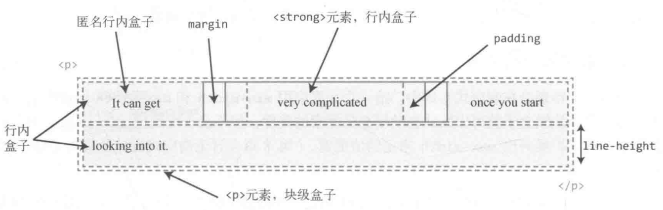
Inline Box
- 内联元素形成外部内联盒子, 让元素不成块显示, 而是排成一行.
- 水平间距可通过
padding-inline/border-inline/margin-inline调整, 垂直间距可通过line-height/vertical-align调整, 垂直间距不受padding-block/border-block/margin-block影响. <span>/<a>/<em>tag 会产生一般内联盒子.- Bare text 会产生匿名内联盒子.
::first-line {
  color: white;
  background: red;
}
Decoration Break
Inline elements can wrap across lines, and their box is "sliced" at line breaks:
box-decoration-break: slice(default): Box is sliced at line breaksbox-decoration-break: clone: Each line segment gets its own complete box
span {
  box-decoration-break: clone;
}
Useful for inline elements with borders/backgrounds that wrap across multiple lines.
Line Box
- 每一行会形成一个行框盒子.
- 每个行框盒子的前面有一个幽灵空白节点
(zero-width inline box with the element's
fontandline heightproperties). 父元素的line-height会幽灵空白节点产生作用. - 将内联元素设置为
display: inline-block可以消除幽灵空白节点.
Lines Containing Box
<p> tag 会形成一个包含盒子, 此盒子由一行一行的行框盒子组成.
在很多情况下, 容器高度莫名奇妙变大,
都是行框盒子幽灵空白节点 (Strut), line-height, vertical-align 共同作用的结果:
- 容器内部除了显式的内联元素外, 每行还存在幽灵空白节点 (
Strut). line-height可继承, 且基于font-size进行计算.vertical-align默认对齐方式为基线对齐 (baseline).
常见例子有:
<div><span></span></div>高度不为0:Strut撑高容器.<div class="leading-8"><span class="text-2xl">文字</span></div>高度不为32px(leading-8): 当Structfont-size与内联元素font-size差距过大时, 进行文字对齐时会撑高容器.<div><img src="1.jpg"></div>下边缘存在空隙:Strut默认基于基线对齐.
Block
- Break onto a new line.
- Extend in inline direction to fill space available in its container.
widthandheightproperties are respected.padding,borderandmarginwill push away other elements.
Block Formatting Context
BFC 包含创建该上下文元素的所有子元素 (包含性):
- 包含内部所有元素的上下外边距: 它们不会跟 BFC 外部的元素产生外边距折叠 (avoid margin collapse).
- 包含内部所有的浮动元素: 计算 BFC 的高度时, 浮动元素也参与计算 (avoid height collapse).
- 不包含创建了新 BFC 的子元素的内部元素.
BFC 是页面上的一个隔离的独立容器 (隔离性):
- BFC 不会跟外部的浮动元素 (
float box) 重叠: 可用于实现自适应布局. - BFC 内部的元素与外部的元素相互隔离, 无法相互影响.
- 一个元素不能同时存在于两个 BFC 中.
- 内部的 Box 会在垂直方向, 一个接一个地放置.
- 每个元素的
margin box的左边, 与包含块border box的左边相接触. - 某些情况下,BFC 中的内容可能会与其他 BFC 中的内容重叠:
- 内容太宽, 溢出了容器.
- 设置负外边距, 导致内容被拉到容器外部.
Creating BFC:
- 根元素或其它包含它的元素.
overflow: notvisible(e.g.hidden).position: notstatic/relative(e.g.absolute/fixed).floatelements.display:inline-block.display:table-cell/table-caption/table-*h.display:flow-root.- Flex items: direct children of
flex/inline-flexbox. - Grid items: direct children of
grid/inline-gridbox.
.bfc-1 {
  overflow: hidden;
}

.bfc-2 {
  display: table-cell;
  *display: inline-block; /* For IE7 */
  width: 9999px;
  *width: auto; /* For IE7 */
}
Sizing
box-sizing:
content-box(initialvalue).padding-box.border-box.
:root {
  box-sizing: border-box;
}

*,
::before,
::after {
  box-sizing: inherit;
}
Box sizing:
Intrinsic Sizing(内在尺寸): 表示元素最终的尺寸表现是由内容决定的, e.g.fit-content/min-content/max-content.Extrinsic Sizing(外在尺寸): 表示元素最终的尺寸表现是由上下文决定的, e.g.stretch/-moz-available/-webkit-fill-available.
Display
The display property can have two parts: an outer and an inner value:
/**
 * Modern equivalent of inline-block
 * Outer value: how element behaves with other elements (inline, block)
 * Inner value: how element behaves with its own content (flow, flow-root, grid, flex)
 */
.display {
  display: inline flow-root;
}
inline-blockis legacy syntax forinline flow-rootdisplay: grid=block grid(outerblockinferred)display: inline=inline flow(innerflowinferred)flow-rootcreates a new block formatting context explicitly
Width
width:
auto: initial value.<length>.<percentage>.min-content | max-content | fit-content | fit-content(<length-percentage>).
% width calculate by containing box width:
- 普通元素的百分比宽度是相对于父元素
content box宽度计算. - 绝对定位元素的百分比宽度是相对于第一个
position不为static的祖先元素padding box宽度计算.
Auto Flow
Auto flow with css-sizing,
fit-content/min-content/max-content/stretch
for width/min-width/max-width/height/min-height/max-height/
grid-template-rows/grid-template-columns/flex-basis:
fit-content: grow but not overflow.
.content {
  width: fit-content;
  margin: auto;
}

.button {
  box-sizing: border-box;
  width: calc(100% - 30px);
  width: stretch;
  height: 40px;
  margin-right: 15px;
  margin-left: 15px;
}

.table {
  box-sizing: border-box;
  width: 100%;
  width: stretch;
  table-layout: fixed;
}
Size Limits
min-width > max-width > width !important:
/* 480px */
.box-1 {
  min-width: 480px;
  max-width: 256px;
}

/* 256px */
.box-2 {
  width: 480px !important;
  max-width: 256px;
}
Height
% height calculate by containing box height:
- 容器高度为
auto(initialvalue) 时, 其高度通常由子元素高度决定: 浏览器为避免高度计算死循环, 会忽略子元素百分比高度声明. - 容器高度为一个明确值时, 子元素百分比高度才会生效.
Flow
普通文档流是为限定的宽度和无限的高度设计的 (网页元素的默认布局行为):
- 行内元素跟随文字的方向从左到右排列, 当到达容器边缘时会换行.
- 块级元素会占据完整的一行, 前后都有换行.
这导致处理元素高度的方式跟处理宽度不一样:
box-sizing 仍然会影响高度, 但最好避免给元素指定明确的高度.
容器的高度由内容 (子元素) 天然地决定, 而不是容器自己决定.
Viewport
.my-element {
  height: 100vh; /* Fallback for browsers that do not support Custom Properties */
  height: calc(var(--vh, 1vh) * 100);
}
window.addEventListener('resize', () => {
  // Get viewport height and multiple it by 1% to get a value for a vh unit
  const vh = window.innerHeight * 0.01
  document.documentElement.style.setProperty('--vh', `${vh}px`)
})
dvhdvh 在移动端上会产生抖动问题, 当用户从首屏开始滚动时, 导航栏的消失会导致 100dvh 的值发生突变.
因此, 只有在不需要上下滚动的页面才用 dvh.
Aspect Ratio
Things can break aspect-ratio:
- Setting both dimensions: setting
inline-sizeandblock-sizesimultaneously. - Stretching element:
align-items: stretch. - Content that forces height: inner elements may force the height of the parent.
Margin
% margin calculate by containing block inline size (width),
include margin-top and margin-bottom.
Auto
CSS2 visual formatting model:
- If both margin-left and margin-right are auto, their used values are equal.
- If margin-top, or margin-bottom are auto, their used value is 0.
Negative
Negative margin change layout flow:
- Negative
margin-top/margin-left: pull self up/left. - Negative
margin-bottom/margin-right: pull sibling up/left, overlapping self. - Negative
marginalongfloatdirection: pull self. - Negative
marginoppositefloatdirection: pull sibling.
.content {
  float: left;
  width: 100%;
  margin-right: -200px;
}

.sidebar {
  float: left;
  width: 200px;
}
Negative horizontal margin on initial width element make width stretch
(just like positive padding):
/* ul width = 100% + 20px */
ul {
  margin-right: -20px;
}

ul > li {
  float: left;
  width: 100px;
  margin-right: 20px;
}

.blockquote {
  margin: 2rem -2rem;
}
Collapse
- Adjacent siblings: 1's
margin-bottomwith 2'smargin-top. - No content separating parent and descendants:
- No
border/padding/inline part/BFC created/clear: can't separate parentsmargin-topfrom its descendant blocksmargin-top. - No
border/padding/inline content/height/min-height: can't separate parentsmargin-bottomfrom its descendant blocksmargin-bottom. - Collapsed
marginends up outside the parent.
- No
- Empty blocks:
no
border/padding/inline content/height/min-heightto separate block'smargin-topfrom itsmargin-bottom.

margin collapsing calculation:
- 正正取大值.
- 正负值相加.
- 负负最负值.
margin collapsing prevention:
- BFC creation: add
overflow: autoto container. - Add
padding. - Add
border.
Margin collapsing only happen to normal block box vertical direction:
- Line box margin never collapse.
floatbox margin never collapse.absolute/fixedpositioned box margin never collapse.flexchildren.gridchildren.
Invalid
display: inline非替换元素 verticalmargin无效.display: table-cell/display: table-row元素margin无效: e.g.<tr>,<td>.position: absolute绝对定位元素未定位方向 (auto)margin:.absolute { top: 10%; left: 30%; }margin-right与margin-bottom改变了外部尺寸, 但无法影响兄弟元素布局.- 定高容器子元素的
margin-bottom或者定宽容器子元素的margin-right的定位作用失效.
Padding
% padding calculate by containing block inline size (width),
include padding-top and padding-bottom:
.box {
  position: relative;
  padding: 10% 50%;
}

.box > img {
  position: absolute;
  top: 0;
  left: 0;
  width: 100%;
  height: 100%;
}
Overflow
visible.hidden: 溢出隐藏基于padding box.clip.scroll.auto.
Line Height
Inline Element
行间距:
- 半行间距 =
(line-height * font-size - font-size) / 2. - 行间距 = 第一行下半行间距 + 第二行上半行间距.
Inheritance
line-height 继承:
%与em继承计算值,number继承数值.line-height最好使用number, 使得子代继承line-height时文字正常排版, 不会出现line-height<font-size导致文字重叠的现象.- Inline level element:
由于
line-height可继承, 一般给父元素设置line-height即可, 会自动作用至容器内所有内联元素. - Block level element:
由于行框盒子幽灵空白节点的存在,
line-height * font-size会决定 block level element 内部元素的最小高度, e.g.<div><span></span></div>高度不为0.
Vertical Align
vertical-align:
- 线类:
baseline,top,middle,bottom. - 文本类:
text-top,text-bottom. - 上标下标类:
sub,super. - 数值: 基于
baseline上移 (正数) / 下移 (负数). - 百分比: calculate by
line-height.

Middle
The middle value is not exact middle of line:
/* middle = baseline + (x-height / 2) */
.text {
  vertical-align: middle;
}
It's calculated from font metrics and line-height,
so it may not align exactly at center.
Applicable Elements
vertical-align 作用元素:
- Inline level element:
<span>/<strong>/<em>.<img>/<button>/<input>.::before/::after.
display: table-cell元素.- 用
display: inline-*或display: table-cell以外的方式 创建Box Formatting Context后,vertical-align不再起作用. - 当
line-height过小时,vertical-align在视觉上失效, 调整line-height至足够大时,vertical-align正常起作用.
Stacking
Level
Positioned element (non-static position), flex box, grid box
can use the z-index property to adjust its stacking level:
数值越大, 处于可视的优先级越大.
Context
- The root element
<html>forms theroot stacking context. absolute/relativeelement with non-autoz-index.fixed/stickyelement.flexchildren with non-autoz-index.gridchildren with non-autoz-index.opacity<element.- non-
normalmix-blend-modeelement. transformelement.perspectiveelement.clip-pathelement.mask/mask-image/mask-borderelement.filterelement.backdrop-filterelement.isolation: isolateelement.container-typeset tosizeorinline-size(container queries).will-changeabove properties element.containstrict/content/layout/paintelement.
isolation: isolate is the most explicit way to create a new stacking context:
.container {
  isolation: isolate;
}
This is useful when you want to create a stacking context without side effects from other properties like opacity or transform.
The z-index of elements inside of a stacking context
are always relative to parent current order in its own stacking context.
<!-- .bottom > .inner is on top -->
<div class="top">
  <div class="inner"></div>
</div>
<div class="bottom">
  <div class="inner"></div>
</div>

<style>
  .top,
  .bottom {
    position: relative;
    width: 250px;
    padding: 80px 20px;
  }

  .top {
    z-index: 1;
  }

  .bottom {
    z-index: 2;
  }

  .top > .inner {
    z-index: 999;
  }

  .bottom > .inner {
    z-index: 2;
  }
</style>
Order
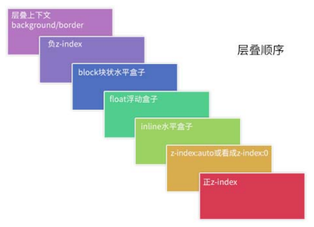
- The background and borders of the root element.
- Descendant non-positioned blocks, in order of appearance in the HTML.
- Descendant positioned elements, in order of appearance in the HTML.
.box {
  /* 创建层叠上下文 */
  position: relative;
  z-index: 0;
  background-image: url('1.png');
}

.box::before,
.box::after {
  position: absolute;
  z-index: -1;
  content: '';
}

.box::before {
  background-image: url('2.png');
}

.box::after {
  background-image: url('3.png');
}
<div class="container">
  <div class="page">标题和内容</div>
</div>

<style>
  .container {
    /* 创建层叠上下文 */
    position: relative;
    z-index: 0;
    background-color: #666;
  }

  .page {
    position: relative;
    background-color: #f4f39e;
  }

  /* 边角卷边阴影 */
  .page::before,
  .page::after {
    /* 层叠上下文(灰色背景)之上, 定位元素(黄色纸张)之下 */
    position: absolute;
    z-index: -1;
    width: 90%;
    height: 20%;
    content: '';
    box-shadow: 0 8px 16px rgb(0 0 0 / 30%);
  }

  /* 边角卷边阴影定位和角度控制 */
  .page::before {
    bottom: 0;
    left: 0;
    transform: skew(-15deg) rotate(-5deg);
    transform-origin: left bottom;
  }

  .page::after {
    right: 0;
    bottom: 0;
    transform: skew(15deg) rotate(5deg);
    transform-origin: right bottom;
  }
</style>
Layout
CSS has multiple layout algorithms:
- Normal flow (default)
- Positioning (
relative,absolute,fixed,sticky) - Flexbox
- Grid
- Table layout (legacy)
- Float (legacy)
- Multi-column
Specific properties let you opt into different layout algorithms.
All complex systems that work evolved from simple systems that worked.
CSS Layout started with a single layout algorithm called normal flow. All subsequent layout algorithms (positioning, Flexbox, Grid) built upon these foundational concepts.
References
- Box model.
- Layout fundamentals.