Column
Block
inline-block+inline-block.
Absolute
absolute+margin-left: absolute element not in normal flow.- 利用父元素
relative与子元素absolute进行布局.
.div-1 {
  position: relative;
}

.div-1a {
  position: absolute;
  top: 0;
  right: 0;
  width: 200px;
}

.div-1b {
  position: absolute;
  top: 0;
  left: 0;
  width: 200px;
}
Position .left and .right with absolute,
add margin-left and margin-right to .middle:
<div class="container">
  <div class="left"></div>
  <div class="middle"></div>
  <div class="right"></div>
</div>

<style>
  .container {
    position: relative;
  }

  .left,
  .right {
    position: absolute;
    width: 200px;
  }

  .middle {
    margin: 0 200px;
  }

  .left {
    left: 0;
  }

  .right {
    right: 0;
  }
</style>
Float
float+float.float+margin-left: block element ignore float element, inline element surround float element.float+ BFC.
.container {
  overflow: hidden; /* BFC creation */
}

.left {
  float: left;
  width: 60px;
  height: 60px;
}

.right {
  margin-left: 70px;
  overflow: hidden; /* BFC creation */
}
<div class="left"></div>
<div class="right"></div>
<div class="middle"></div>
3 column layout:
.left {
  float: left;
}

.right {
  float: right;
}

.middle {
  margin: 0 var(--right-width) 0 var(--left-width);
}
Negative Margin
For float element:
- Negative
marginalong the float direction: pull thefloatelement in that direction. - Negative
marginopposite the float direction decrease the float area, causing adjacent elements to overlap thefloatelement.
圣杯布局:
- HTML:
.middlefirst. - Padding:
padding-leftandpadding-rightto.container,min-width: 2 * (leftWidth + rightWidth)to.container. - Float:
float: leftto.left,.middleand.right(Currently,.middlein row 1,.leftand.rightin row 2). - Negative margin:
margin-left: -100%to.left,margin-right: -rightWidth pxto.right(Pull them up to same row with.middle). - Move:
right: leftWidth pxto.left(Adjust.leftposition).
<div class="container">
  <div class="middle"></div>
  <div class="left"></div>
  <div class="right"></div>
</div>
.container {
  padding: 0 200px 0 300px; /* padding-left = .left width, same to .right */
}

.container .middle {
  float: left;
  width: 100%;
  background-color: violet;
}

.container .left {
  position: relative;
  right: 300px;
  float: left;
  width: 300px;
  margin-left: -100%;
  background-color: darkblue;
}

.container .right {
  position: relative;
  float: left;
  width: 200px;
  margin-right: -200px;
  background-color: red;
}
Flex
.fifty-fifty-flex {
  display: flex;
  flex-wrap: wrap;
}

.fifty-fifty-flex > * {
  flex-grow: 1;
  flex-basis: 250px;
}

.fifty-fifty-grid {
  display: grid;
  grid-template-columns: repeat(auto-fit, minmax(250px, 1fr));
}
Grid
Three column layout allows full-width content:
.container {
  display: grid;
  grid-template-columns: 1fr min(60ch, calc(100% - 64px)) 1fr;
  column-gap: 32px;
}

.container > * {
  grid-column: 2;
}

.full-bleed {
  grid-column: 1 / -1;
  width: 100%;
}
Multiple
Multiple column layout:
columns:<'column-width'> || <'column-count'>.- 分栏实际数目 = .
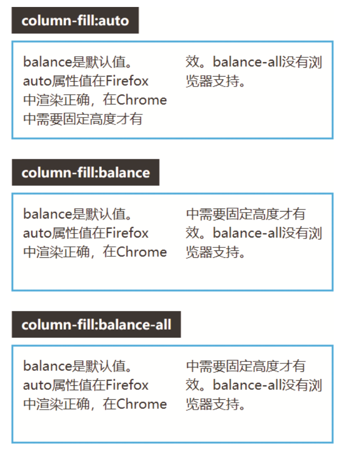
column-width:auto | <length>, 期望分栏宽度.column-count:auto | <integer>, 期望分栏数目.column-gap:normal | <length-percentage>, 分隔间隙.column-rule:<'column-rule-width'> || <'column-rule-style'> || <'column-rule-color'>, 分隔线.column-rule-width(<line-width>):medium | thin | thick | <length>.column-rule-style(<line-style>):none | hidden | dotted | dashed | solid | double | groove | ridge | inset | outset.column-rule-color:currentcolor | <color>.column-span:none | all, 子元素宽度.column-fill:balance | balance-all | auto, 子元素分布.break-inside:auto: Allows break.avoid: Avoids break.
.three-column {
  column-gap: 1em;
  padding: 1em;
  column-count: 3;
}

.three-column > .last-child {
  column-span: all;
}