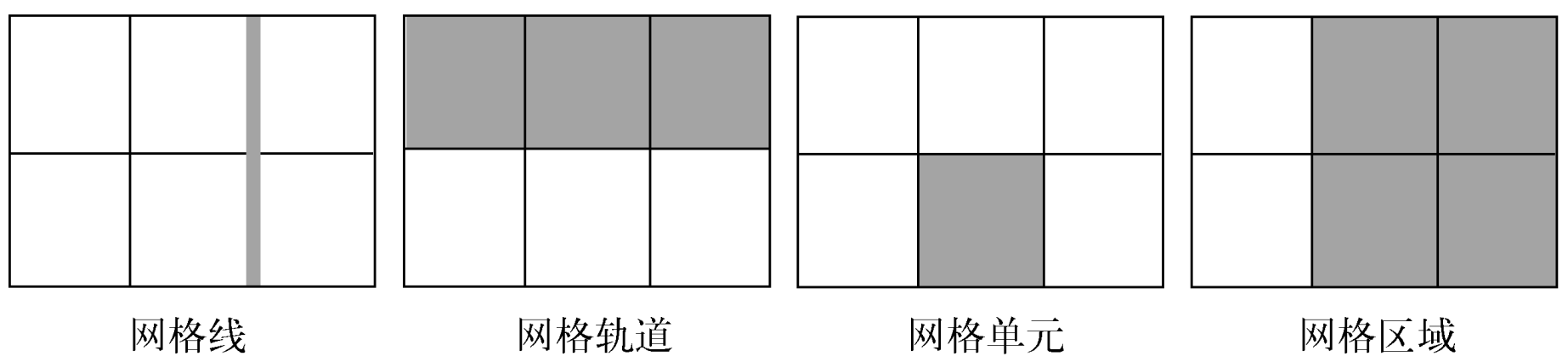
Grid
Width
Automatic Minimum Size
Grid item default min-width is set to auto,
grid item can't be smaller than its children:
<div class="grid">
  <div class="item">
    <p>Very very very very very long sentence.</p>
  </div>
  <div class="item">
    <p>Very very very very very long sentence.</p>
  </div>
  <div class="item">
    <p>Very very very very very long sentence.</p>
  </div>
  <div class="item">
    <p>Very very very very very long sentence.</p>
  </div>
  <div class="item">
    <p>Very very very very very long sentence.</p>
  </div>
  <div class="item">
    <p>Very very very very very long sentence.</p>
  </div>
</div>

<style>
  .grid {
    display: grid;
    grid-template-columns: repeat(3, 1fr);
    gap: 20px;
  }

  /**
   * Grid item default `min-width` is `auto`,
   * 导致 grid item 内的段落完整显示整行长句.
   */
  .item {
    border: 1px solid red;
  }

  /**
   * Grid item 内的段落正常截断.
   */
  .item-fixed {
    /* Method 1 */
    min-width: 0;

    /* Method 2 */
    overflow: hidden;
  }

  p {
    overflow: hidden;
    text-overflow: ellipsis;
    white-space: nowrap;
  }
</style>
Properties
Parent
grid:grid-template:grid-template-rows.grid-template-columns.grid-template-areas.
grid-auto-rows.grid-auto-columns.grid-auto-flow.
gap:row-gap.column-gap.
place-content:align-content.justify-content.
place-items.align-items.justify-items.
Children
grid-area:grid-row:grid-row-start.grid-row-end.
grid-column:grid-column-start.grid-column-end.
place-self:align-self.justify-self.
.container {
  grid-template-areas:
    'header header header'
    'advert content content'
    'footer footer footer';
  grid-template-rows: 1fr 1fr 1fr;
  grid-template-rows: minmax(90px, 1fr);
  grid-template-columns: 1fr 1fr 1fr;
  grid-template-columns: repeat(3, 1fr);
  gap: 10px;
  place-items: end center;
}

.item {
  grid-area: footer;
  grid-row: start / end; /* 2 / -1 */
  grid-column: start / end;
  place-self: end center;
}
Data Types
Breadth
<track-breadth>:
<flex>:<number>fr, fraction.<length-percentage>.min-content.max-content.auto.
<inflexible-breadth>:
<length-percentage>.min-content.max-content.auto.
<fixed-breadth>:
<length-percentage>.
Size
<track-size>:
<track-breadth>.minmax(<inflexible-breadth>, <track-breadth>).fit-content(<length-percentage>).
<fixed-size>:
<fixed-breadth>.minmax(<fixed-breadth>, <track-breadth>).minmax(<inflexible-breadth>, <fixed-breadth>).
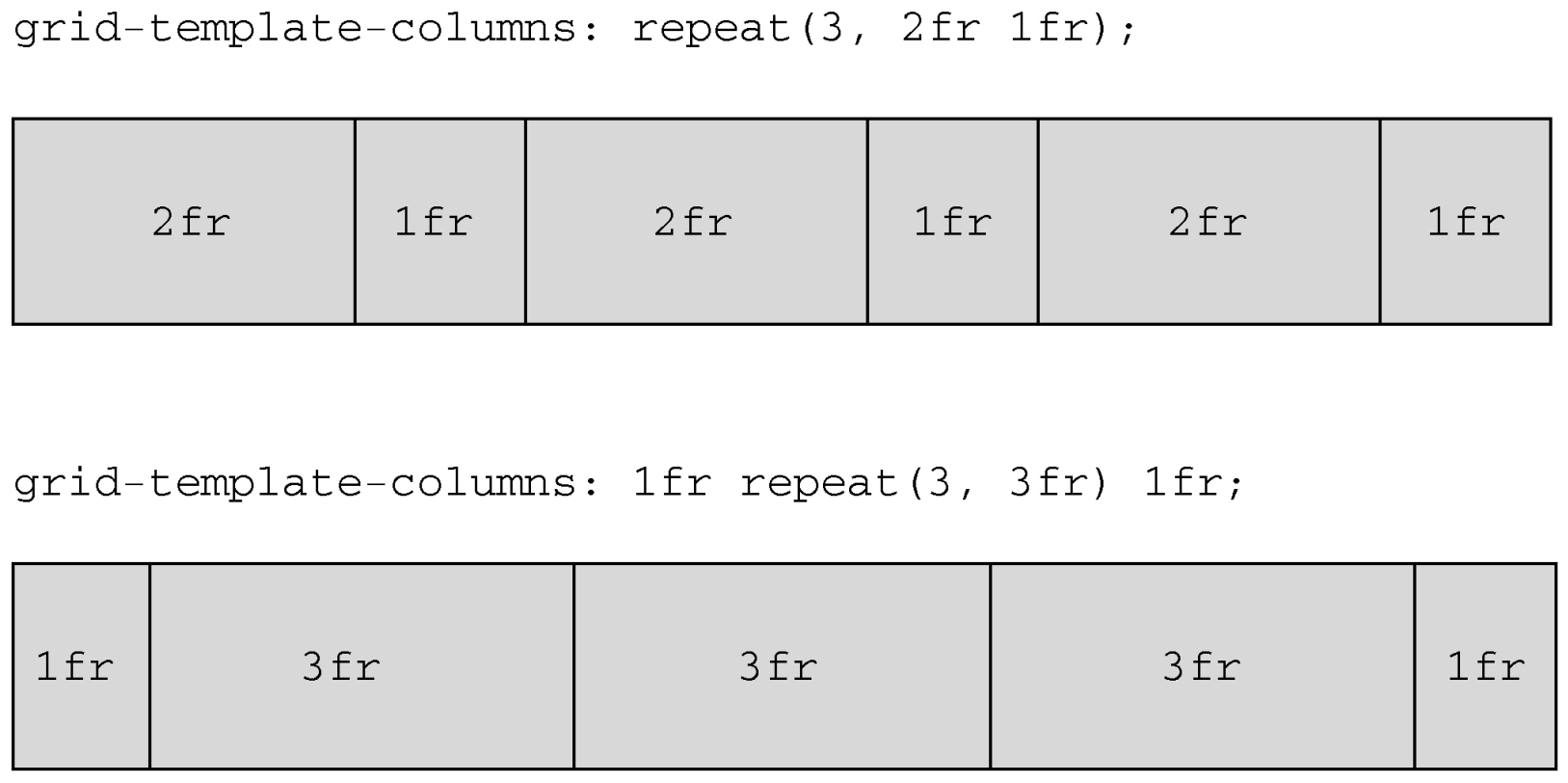
Repeat
<track-repeat>:
repeat([<integer [1,∞]>], [<line-names>? <track-size>]+ <line-names>?).
<fixed-repeat>:
repeat([<integer [1,∞]>], [<line-names>? <fixed-size>]+ <line-names>?).
<auto-repeat>:
repeat([auto-fill | auto-fit], [<line-names>? <fixed-size>]+ <line-names>?).
<name-repeat>:
repeat([auto-fill | <integer [1,∞]>], <line-names>+).
One of the all-time great CSS tricks:
.grid {
  display: grid;
  grid-template-columns: repeat(auto-fit, minmax(200px, 1fr));
  gap: 1rem;
}
Line
<grid-line>:
auto.<custom-ident>[<integer> && <custom-ident>?].[span && [<integer> || <custom-ident>]].
Responsive Layout
Explicit
fit-content(limit):clamp([min-content | min-width], limit, max-content).minmax([<fixed-breadth> | <inflexible-breadth>], [<track-breadth> | <fixed-breadth>]).repeat([<integer [1,∞]> | auto-fill | auto-fit], [<track-size> | <fixed-size>]+).
.container {
  display: grid;
  grid-template-columns: fit-content(var(--sidebar-max, 20ch)) minmax(50%, 1fr);
  grid-template-columns: repeat(auto-fit, minmax(400px, 1fr));
  grid-template-columns: repeat(auto-fit, minmax(min(100%, var(--grid-min, 30ch)), 1fr));
}
Implicit
grid-auto-rows/grid-auto-columns:
<track-size>+.- Control implicitly-created grid track (row/column) size.
<div class="container">
  <item>1</item>
  <item>2</item>
  <item>3</item>
  <item>4</item>
  <item class="implicit">5</item>
</div>

<style>
  .container {
    display: grid;
    grid-template: 1fr 1fr / 1fr 1fr;

    /* 隐式网格高度为 60px */
    grid-auto-rows: 60px;
  }
</style>
<div class="container">
  <item class="item-a">a</item>
  <item class="item-b">b</item>
</div>
<style>
  .container {
    display: grid;
    grid-template: 1fr 1fr / 1fr 1fr;

    /* 隐式网格宽度为 60px */
    grid-auto-columns: 60px;
  }

  .item-b {
    /* 超出网格列数, 隐式网格创建 */
    grid-column: 3 / 4;
    background-color: rgb(255 255 0 / 50%);
  }
</style>

grid-auto-flow:
[row | column] || dense.- Change auto-placement algorithm:
control exactly how auto-placed items get flowed into grid container,
like
flex-directionfor flex container.
.gallery {
  display: grid;
  grid-template-columns: repeat(auto-fill, minmax(200px, 1fr));
  grid-auto-rows: 1fr;
  grid-auto-flow: dense;
  gap: 1em;
}
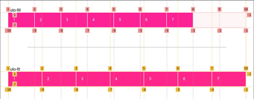
Count auto-fit Columns
Count auto-fit columns guide:
.grid {
  --u: 7em;

  display: grid;
  grid-template-columns: repeat(auto-fit, var(--u));
  container-type: inline-size;
}

.grid::before {
  --n: round(down, 100cqw / var(--u));

  content: counter(n);
  counter-reset: n var(--n);
}
Named Layout
Lines
grid-row and grid-column
change start and end of <grid-line>
will refactor grid item's size and location:
.main {
  display: grid;
  grid-template-rows: [header] 100px [body] auto;
  grid-template-columns: [l-gutter] 1fr [sidebar] 4fr [content] 8fr [r-gutter] 1fr;
  gap: 1rem 2rem;
}

.header {
  grid-row: header;
  grid-column: sidebar / right-gutter;
}

.sidebar {
  grid-row: body;
  grid-column: sidebar;
}

.content {
  grid-row: body;
  grid-column: content;
}
隐式网格线:
<custom-ident>: 当<custom-ident>不存在时, 会尝试匹配<custom-ident-start>或者<custom-ident-end>.<integer> && <custom-ident>: 当第<integer>个<custom-ident>不存在时, 会在网格容器后方额外创建隐式网格.span && <custom-ident>: 当<custom-ident>不存在时, 会在网格容器前方或者后方额外创建隐式网格.
.container {
  display: grid;
  grid:
    '. . .' 1fr
    '. a .' 1fr
    '. . .' 1fr / 1fr 1fr 1fr;
}

.item {
  grid-area: a;
  grid-area: a / a / a / a;
  grid-area: a-start / a-start / a-end / a-end;
}
.container {
  display: grid;
  grid-template-columns: [a] 80px [b] auto [c] 100px [d];
}

.item {
  /**
   * .container: [a] 80px [b] auto [c] 100px [d] auto [b] auto [b] auto [b]
   * .item: [c] 100px [d] auto [b] auto [b] auto [b]
   */
  grid-column: b 4 / c;
}
.container {
  display: grid;
  grid-template-columns: [a] 80px [c] auto [c] 100px [d] auto auto;
}

.item {
  /**
   * .container: [b] auto [a] 80px [c] auto [c] 100px [d] auto auto
   * .item: [b] auto [a] 80px [c] auto [c] 100px [d]
   */
  grid-column: span b / 4;
}
Extending elements beyond the content area with named grid lines:
.content {
  --gap: clamp(1rem, 6vw, 3rem);
  --full: minmax(var(--gap), 1fr);
  --content: min(50ch, 100% - var(--gap) * 2);
  --popup: minmax(0, 2rem);
  --feature: minmax(0, 5rem);

  display: grid;
  grid-template-columns:
    [full-start] var(--full)
    [feature-start] var(--feature)
    [popup-start] var(--popup)
    [content-start] var(--content) [content-end]
    var(--popup) [popup-end]
    var(--feature) [feature-end]
    var(--full) [full-end];
}

.content > * {
  grid-column: content;
}

.popup {
  grid-column: popup;
}

.feature {
  grid-column: feature;
}

.full {
  grid-column: full;
}
Areas
- 网格线自动命名:
areaName-start/areaName-end.
.container {
  grid-template: 1fr 1fr 1fr 1fr / 1fr 1fr 1fr;
  grid-template:
    'grape grape grape' 1fr
    'apple orange orange' 1fr
    'apple orange orange' 1fr
    'banana banana banana' 1fr
    / 1fr 1fr 1fr;
  grid-template:
    [row-name1-start] 'grape grape grape' 1fr [row-name1-end row-name2-start]
    'apple orange orange' 1fr [row-name2-end]
    'apple orange orange' 1fr [row-name3-end]
    [row-name4-start] 'banana banana banana' 1fr [row-name4-end]
    / [col-name-start] 1fr [col-name-end] 1fr 1fr;
  grid-template-areas:
    'grape grape grape'
    'apple orange orange'
    'apple orange orange'
    'banana banana banana';
}

.grape {
  grid-area: grape;
}

.apple {
  grid-area: apple;
}

.orange {
  grid-area: orange;
}

.banana {
  grid-area: banana;
}
Gap
CSS Box Alignment Module Level 3
统一了分栏布局, 弹性布局, 网格布局的 gap 属性:
gap:<'row-gap'> <'column-gap'>?.row-gap:normal | <length-percentage>.column-gap:normal | <length-percentage>.
Alignment
justify-content/align-contentcontent within element, attach to parent css selector (effectively adjustspaddingof parent)justify-items/align-itemsalign items inside box, attach to parent css selector (effectively adjustsmarginof children)justify-self/align-selfalign element within parent, attach to children css selector (effectively adjustsmarginof children)place-content:<'align-content'> <'justify-content'>?.place-items:<'align-items'> <'justify-items'>?.place-self:<'align-self'> <'justify-self'>?.
justify-items, defines the defaultjustify-selffor all items:normal: behaves asstretch/start.baseline.stretch.center/start/end/self-start/self-end/flex-start/flex-end.left/right.
justify-self:auto: computes to parentjustify-itemsvalue.normal: behaves asstretch/start.baseline.stretch.center/start/end/self-start/self-end/flex-start/flex-end.left/right.

Pseudo Element
Adding background and border is a missing feature of
CSS Grid specification,
you can styling empty grid cells and areas with
generated pseudo elements:
.grid::after {
  z-index: -1;
  grid-row: 1 / 4;
  grid-column: 2 / 5;
  content: '';
  background-color: rgb(214 232 182 / 30%);
  border: 5px solid rgb(214 232 182);
}
Implement fancy <h1> header:
h1.lines {
  display: grid;
  grid-template-columns: 1fr auto 1fr;
  gap: 1em;
  text-align: center;
}

@supports (display: grid) {
  h1.lines::before,
  h1.lines::after {
    align-self: center;
    content: '';
    border-top: 1px solid black;
  }
}
Conditionally styling selected elements in grid container:
<main>
  <input type="checkbox" />
  <input type="checkbox" />
  <input type="checkbox" />
  <input type="checkbox" />
  <input type="checkbox" />
  <input type="checkbox" />
  <input type="checkbox" />
  <input type="checkbox" />
  <input type="checkbox" />
  <input type="checkbox" checked />
  <input type="checkbox" checked />
  <input type="checkbox" checked />
  <input type="checkbox" checked />
  <input type="checkbox" />
  <input type="checkbox" />
  <input type="checkbox" />
  <input type="checkbox" />
  <input type="checkbox" />
  <input type="checkbox" />
  <input type="checkbox" />
  <input type="checkbox" />
  <input type="checkbox" />
  <input type="checkbox" />
  <input type="checkbox" />
  <input type="checkbox" />
  <input type="checkbox" />
  <input type="checkbox" />
  <input type="checkbox" />
  <input type="checkbox" />
  <input type="checkbox" />
</main>

<style>
  main {
    display: grid;
    grid: repeat(5, 60px) / repeat(7, 60px);
    place-items: center center;
    margin: 0;
  }

  input {
    display: grid;
    width: 40px;
    height: 40px;
    margin: 0;
    appearance: none;
    cursor: pointer;
    background: #ddd;
    border-radius: 20px;
  }

  input:not(:nth-of-type(7n + 1))::before,
  input:nth-of-type(n + 8)::after {
    z-index: -1;
    grid-area: 1/1;
    pointer-events: none;
    content: '';
    border-radius: 20px;
  }

  input:not(:nth-of-type(7n + 1))::before {
    transform: translateX(-60px);
  }

  input:nth-of-type(n + 8)::after {
    transform: translateY(-60px);
  }

  input:checked {
    background: limegreen;
  }

  /* a box's right borders */
  input:not(:nth-of-type(7n)):checked + input:checked::before {
    background: limegreen;
    border-top-right-radius: 0;
    border-bottom-right-radius: 0;
  }

  /* a box's bottom borders */
  input:nth-last-of-type(n + 8):checked + * + * + * + * + * + * + input:checked::after {
    background: limegreen;
    border-bottom-right-radius: 0;
    border-bottom-left-radius: 0;
  }

  /* a box's adjacent (right side) box's left borders */
  input:not(:nth-of-type(7n)):checked + input:checked + input::before {
    background: limegreen;
    border-top-left-radius: 0;
    border-bottom-left-radius: 0;
  }

  /* a box's adjacent (below) box's top borders */
  input:not(:nth-of-type(7n)):checked + * + * + * + * + * + * + input:checked + input::before {
    background: limegreen;
    border-top-left-radius: 0;
    border-top-right-radius: 0;
  }

  /* a box's (in last column) left borders */
  input:nth-of-type(7n-1):checked + input:checked {
    border-top-left-radius: 0;
    border-bottom-left-radius: 0;
  }

  /* a box's (in last column) adjacent (below) box's top borders */
  input:nth-of-type(7n):checked + * + * + * + * + * + * + input:checked {
    border-top-left-radius: 0;
    border-top-right-radius: 0;
  }
</style>
Grid System
- Must have different traits at different sizes.
- Must be fluid between breakpoints.
- Must have enough control to decide which columns will transform and at which point.
- Classes should ideally still make sense at all breakpoints.
Masonry
- Chrome debates on masonry layouts.
- Webkit invents masonry layouts for CSS grid level 3.
References
- Grid complete guide.