SVG
Size
Shape will zoom to fill size of SVG width and height:
<!-- viewBox = <min-x> <min-y> <width> <height> -->
<svg width="198px" height="188px" viewBox="0 0 99 94"></svg>
Fill
<svg width="100px" height="100px" viewBox="0 0 100 100" version="1.1" xmlns="...">
  <title>My Awesome SVG</title>
  <circle class="circle" cx="50" cy="50" r="50" fill="#FFFF00" />
</svg>

<style>
  .circle {
    fill: currentcolor;
    fill-rule: nonzero;
    fill-opacity: 0.5;
  }
</style>
Stroke
circle {
stroke: blue;
stroke-opacity: 0.5;
stroke-width: 2px;
stroke-linecap: round;
stroke-linejoin: round;
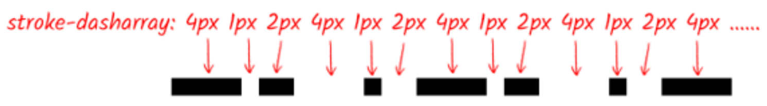
stroke-dasharray: 14px 4px 4px 4px; /* 实色长度 透明长度 实色长度 透明长度 ... */
stroke-dashoffset: 0;
paint-order: stroke;
vector-effect: non-scaling-stroke;
}


利用 stroke-dasharray 与 stroke-dashoffset 实现动画线条:
<a class="container">
  <svg height="100%" width="100%" xmlns="http://www.w3.org/2000/svg">
    <rect class="outline" height="100%" width="100%" />
    <div class="text">SVG Animations</div>
  </svg>
</a>

<style>
  .container .outline {
    stroke-dasharray: 25 25;
    stroke-dashoffset: -588;
  }

  .container:hover .outline {
    stroke-dasharray: 50 50;
    stroke-dashoffset: -275;
  }
</style>
Marker
polyline {
  marker-start: url('#marker-circle');
  marker-mid: url('#marker-circle');
  marker-end: url('#marker-arrow');
}
Shape
- Rectangles and squares:
<rect>. - Circles:
<circle>. - Ellipse:
<ellipse>. - Line:
<line>. - Polyline:
<polyline>. - Polygon:
<polygon>. - Path:
<path>.
Text
The text tag <text> is used to create selectable and accessible text:
text {
  /* SVG text vertical alignment */
  dominant-baseline: auto;
  dominant-baseline: middle;
  dominant-baseline: central;
  dominant-baseline: alphabetic;
  dominant-baseline: hanging;
  dominant-baseline: ideographic;
  dominant-baseline: mathematical;

  /* SVG text horizontal alignment */
  text-anchor: start;
  text-anchor: middle;
  text-anchor: end;
}
Title
The title <title> and description <desc> tags
are specifically for providing accessibility content.
Group
The group tag <g> is used to group elements together
to add class names and apply animations, filters, patterns and effects
to a group of elements.
Defs
The defs tag <defs> is used to define elements for later reuse.
This is where you create
marker, patterns, filters, masks
to be reused later.
This is also used to create icon systems.
<svg width="0" height="0" style="position: absolute">
  <defs>
    <marker id="marker-circle" markerWidth="8" markerHeight="8" refX="4" refY="4">
      <circle cx="4" cy="4" r="2.5" />
    </marker>
    <marker id="marker-arrow" markerWidth="12" markerHeight="12" refX="2" refY="6" orient="auto">
      <path d="M2,3 L2,10 L8,6 L2,3" />
    </marker>
  </defs>
  <defs>
    <filter id="blur">
      <feGaussianBlur in="SourceGraphic" stdDeviation="5" />
    </filter>
  </defs>
</svg>
Path
<div class="circle-word">
  <svg width="400px" height="300px" viewBox="0 0 400 200" version="1.1" xmlns="http://www.w3.org/2000/svg">
    <defs>
      <path id="textCircle" d="M 20 100 A 80 80 0 0 0 180 100 A 80 80 0 0 0 20 100" fill="none" stroke="#333"></path>
    </defs>
    <text class="textCircle" fill="yellowgreen">
      <textPath xmlns:xlink="http://www.w3.org/1999/xlink" xlink:href="#textCircle">
        这是一段随着 path 路径绘制的文字
      </textPath>
    </text>
  </svg>
</div>
Clip Path
<svg class="svg">
  <clipPath id="circle" clipPathUnits="objectBoundingBox">
    <path
      d="M0.5,0 C0.776,0,1,0.224,1,0.5 C1,0.603,0.969,0.7,0.915,0.779 C0.897,0.767,0.876,0.76,0.853,0.76 C0.794,0.76,0.747,0.808,0.747,0.867 C0.747,0.888,0.753,0.908,0.764,0.925 C0.687,0.972,0.597,1,0.5,1 C0.224,1,0,0.776,0,0.5 C0,0.224,0.224,0,0.5,0"
    />
  </clipPath>
</svg>
.item {
  clip-path: url('#circle');
}
Mask
Avatar with circle status indicator:
<svg role="none">
  <mask id="circle">
    <circle fill="white" cx="100" cy="100" r="100"></circle>
    <circle fill="black" cx="86%" cy="86%" r="18"></circle>
  </mask>
  <g mask="url(#circle)">
    <image x="0" y="0" width="100%" height="100%" xlink:href="avatar.jpg"></image>
    <circle fill="none" cx="100" cy="100" r="100" stroke="rgb(0 0 0 / 10%)" stroke-width="2"></circle>
  </g>
</svg>
Filter
内投影滤镜:
<svg width="300" height="300" viewBox="0 0 20 20" style="position: absolute; left: -999px">
  <filter id="inset-shadow">
    <!-- 投影偏移 -->
    <feOffset dx="0" dy="0" />
    <!-- 投影模糊 -->
    <feGaussianBlur stdDeviation="6" result="offset-blur" />
    <!-- 反转投影使其变成内投影 -->
    <feComposite operator="out" in="SourceGraphic" in2="offset-blur" result="inverse" />
    <!-- 内投影附加黑色 -->
    <feFlood flood-color="black" flood-opacity=".95" result="color" />
    <feComposite operator="in" in="color" in2="inverse" result="shadow" />
    <!-- 把内投影显示在图像上 -->
    <feComposite operator="over" in="shadow" in2="SourceGraphic" />
  </filter>
</svg>
毛玻璃滤镜:
<svg width="0" height="0" style="position: absolute">
  <filter id="blur" color-interpolation-filters="sRGB">
    <feGaussianBlur stdDeviation="6" edgeMode="duplicate" />
    <feComponentTransfer>
      <feFuncA type="discrete" tableValues="0 1" />
    </feComponentTransfer>
  </filter>
</svg>
<svg>
  <defs>
    <filter id="fe1">
      <feTurbulence id="animation" type="fractalNoise" baseFrequency="0.00001 9.9999999" numOctaves="1" result="warp">
        <animate
          attributeName="baseFrequency"
          from="0.00001 9.9999"
          to="0.00001 0.001"
          dur="2s"
          repeatCount="indefinite"
        />
      </feTurbulence>
      <feOffset dx="-90" dy="-90" result="warpOffset"></feOffset>
      <feDisplacementMap
        xChannelSelector="R"
        yChannelSelector="G"
        scale="30"
        in="SourceGraphic"
        in2="warpOffset"
      ></feDisplacementMap>
    </filter>
    <filter id="fe2">
      <feTurbulence id="animation" type="fractalNoise" baseFrequency="9.9999999 0.00001" numOctaves="1" result="warp">
        <animate
          attributeName="baseFrequency"
          from="9.9999999 0.00001"
          to="0.009 0.00001"
          dur="2s"
          repeatCount="indefinite"
        />
      </feTurbulence>
      <feOffset dx="-90" dy="-90" result="warpOffset"></feOffset>
      <feDisplacementMap
        xChannelSelector="R"
        yChannelSelector="G"
        scale="30"
        in="SourceGraphic"
        in2="warpOffset"
      ></feDisplacementMap>
    </filter>
  </defs>
</svg>
Animation
CSS
CSS animation on SVG properties:
circle {
  animation: zoom-in-out 1s infinite alternate;
}

@keyframes zoom-in-out {
  from {
    r: 60px;
  }

  to {
    r: 75px;
  }
}
SMIL
<svg width="360" height="200" xmlns="http://www.w3.org/2000/svg">
  <text font-family="microsoft yahei" font-size="40" x="0" y="0" fill="#cd0000">
    马
    <animateMotion
      path="M10,80 q100,120 120,20 q140,-50 160,0"
      begin="0s"
      dur="3s"
      rotate="auto"
      repeatCount="indefinite"
    />
  </text>
  <path d="M10,80 q100,120 120,20 q140,-50 160,0" stroke="#cd0000" stroke-width="2" fill="none" />
</svg>
APIs
const svgElement = document.createElementNS('http://www.w3.org/2000/svg', 'svg')
const svgRectElement = document.createElementNS(
  'http://www.w3.org/2000/svg',
  'rect'
)
References
- SVG filter complete guide.