Transform
transform:
- No affect on the CSS box model layout (excepts
overflow). - No affect on
display: inlineelement. - Affect the visual rendering.
- Affect client rectangles exposed by
Element Interface Extensions(getClientRects()/getBoundingClientRect()). - Affect after
clip/clip-path: firstclip/clip-path, thentransform. - Create new stacking context.
- Create new containing block
for
absolute/fixedpositioned children. <transform-function>+: 多重变换从右向左按顺序执行.
Translate
translate()/translateX()/translateY()/translateZ()/translate3d():
.translate {
  /* 往右偏移10px, 往下偏移20px */
  transform: translate(10px, 20px);

  /* 往右偏移10px */
  transform: translateX(10px);

  /* 往下偏移20px */
  transform: translateY(20px);

  /* 往左偏移自身宽度的一半, 往上偏移自身高度的一半 */
  transform: translate(-50%, -50%);
}
Scale
scale()/scaleX()/scaleY()/scaleZ()/scale3d():
.scale {
  /* 水平放大 2 倍, 垂直缩小 1/2 */
  transform: scale(2, 0.5);

  /* 水平放大 2 倍 */
  transform: scaleX(2);

  /* 垂直缩小 1/2 */
  transform: scaleY(0.5);

  /* 水平翻转效果 */
  transform: scaleX(-1);

  /* 垂直翻转效果 */
  transform: scaleY(-1);
}
Rotate
rotate()/rotateX()/rotateY()/rotateZ()/rotate3d():
deg: degrees 角度 ( ~ ).grad: grads 百分度 ( ~ ).rad: radians 弧度 ().turn: turns 圈数.
.rotate {
  /* 正值顺时针, 负值逆时针 */
  transform: rotate(45deg);
  transform: rotate(50grad);
  transform: rotate(0.7854rad);
  transform: rotate(0.25turn);
}
Skew
skew()/skewX()/skewY():
.skew {
  /* 水平切斜 10 度, 垂直切斜 20 度 */
  transform: skew(10deg, 20deg);

  /* 水平切斜10度 */
  transform: skewX(10deg);

  /* 垂直切斜20度 */
  transform: skewY(20deg);
}

Matrix
matrix(a, b, c, d, e, f):
Translate:
Scale:
Rotate:
Skew:
.matrix {
  transform: matrix(1, 0, 0, 1, var(--translate-x), var(--translate-y));
  transform: matrix(var(--scale-x), 0, 0, var(--scale-y), 0, 0);
  transform: matrix(var(--cos), var(--sin), var(--sin-minus), var(--cos), 0, 0);
  transform: matrix(1, var(--tan-y), var(--tan-x), 1, 0, 0);
}
Origin
transform-origin
change transform start point:
- X offset:
<length>/<percentage>/left/center/right. - Y offset:
<length>/<percentage>/top/center/bottom. - Z offset:
<length>.
.transform-origin {
  /* One-value syntax, the other is `50%`/`center` */
  transform-origin: 2px;
  transform-origin: bottom;

  /* x-offset | y-offset */
  transform-origin: 3cm 2px;
  transform-origin: left 2px;

  /* x-offset | y-offset | z-offset */
  transform-origin: 2px 30% 10px;
  transform-origin: left 5px -3px;
}
Individual
Individual transform property:
.element {
  rotate: 90deg;
  rotate: y 0.25turn;
  rotate: z 1.57rad;
  rotate: 1 1 1 90deg;
  scale: 2;
  scale: 2 0.5;
  scale: 2 0.5 2;
  translate: 50%;
  translate: 100px 200px;
  translate: 50% 105px;
  translate: 50% 105px 5rem;
}
Style
transform-style:
flat: initial value, 表示平面变换.preserve-3d: 表示 3D 透视变换.
Perspective
perspective 为 3D 转换元素定义透视视图:
.parent {
  perspective: 201px;
}
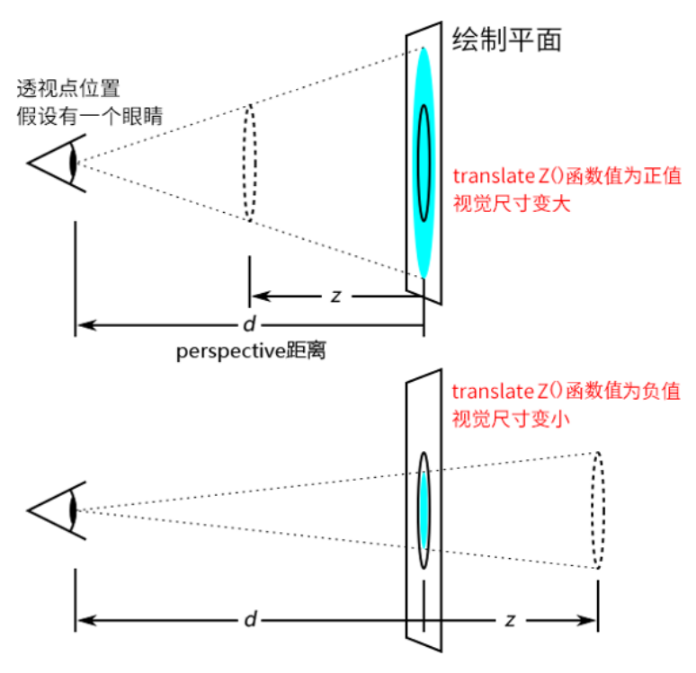
- 设置的
translateZ值越小, 则子元素大小越小 (因为元素远去, 我们眼睛看到的就会变小). translateZ值越大, 该元素也会越来越大.- 当
translateZ值非常接近 201 像素, 但是不超过 201 像素的时候 (如 200 像素). 该元素的大小就会撑满整个屏幕 (父辈元素没有overflow: hidden的限制). - 当
translateZ值再变大, 超过 201 像素的时候, 该元素看不见了.
Backface Visibility
.element {
  backface-visibility: hidden;
}
当元素 rotateY(180deg) 时, 元素将被隐藏.
Container
:hovershould not add to transformed elements,:hovershould add to parent element.- 3D 变换一般需要在容器元素上加上以下样式:
.transform-container {
  transform-style: preserve-3d;
  perspective: 1024px;
}

.front .back {
  backface-visibility: hidden;
}
Alignment
- Keep
translate(-50%, -50%)in keyframe transform property list when using it for alignment. - 父元素设置了
transform变换,position: fixed子元素固定定位失效. - 父元素设置了
transform变换 +overflow: hidden,position: absolute子元素会被剪裁. - 当变换绝对定位居中的元素时, 需要改变
transform-origin:
.rotate {
  position: absolute;
  top: 200px;
  left: 50%;
  transform: translateX(-50%);
  transform-origin: left;
}
References
- Transform 101 guide.