Transition
Property
transition-property:all(initial value).transition-duration.transition-timing-function:<easing-function>.transition-delay: 支持负值.
.element {
  transition: all 0s ease 0s;
  transition: transform 0.5s ease-in-out 0.2s;
}

@media only screen and (prefers-reduced-motion: reduce) {
  .element {
    transition: none;
  }
}
Timing Function
liner.<cubic-bezier-timing-function>:ease:cubic-bezier(0.25, 0.1, 0.25, 1.0).ease-in:cubic-bezier(0.42, 0, 1.0, 1.0).ease-out:cubic-bezier(0, 0, 0.58, 1.0).ease-in-out:cubic-bezier(0.42, 0, 0.58, 1.0).cubic-bezier(<number [0,1]>, <number>, <number [0,1]>, <number>).
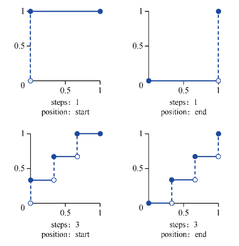
<step-timing-function>:step-start.step-end.steps(<integer>[, jump-start | jump-end | jump-none | jump-both | start | end]?).- 可用
animated
background-position+<step-timing-function>+ image sprites 模拟 GIFs.
:root {
  --ease-in-quad: cubic-bezier(0.55, 0.085, 0.68, 0.53);
  --ease-in-cubic: cubic-bezier(0.55, 0.055, 0.675, 0.19);
  --ease-in-quart: cubic-bezier(0.895, 0.03, 0.685, 0.22);
  --ease-in-quint: cubic-bezier(0.755, 0.05, 0.855, 0.06);
  --ease-in-expo: cubic-bezier(0.95, 0.05, 0.795, 0.035);
  --ease-in-circ: cubic-bezier(0.6, 0.04, 0.98, 0.335);
  --ease-out-quad: cubic-bezier(0.25, 0.46, 0.45, 0.94);
  --ease-out-cubic: cubic-bezier(0.215, 0.61, 0.355, 1);
  --ease-out-quart: cubic-bezier(0.165, 0.84, 0.44, 1);
  --ease-out-quint: cubic-bezier(0.23, 1, 0.32, 1);
  --ease-out-expo: cubic-bezier(0.19, 1, 0.22, 1);
  --ease-out-circ: cubic-bezier(0.075, 0.82, 0.165, 1);
  --ease-in-out-quad: cubic-bezier(0.455, 0.03, 0.515, 0.955);
  --ease-in-out-cubic: cubic-bezier(0.645, 0.045, 0.355, 1);
  --ease-in-out-quart: cubic-bezier(0.77, 0, 0.175, 1);
  --ease-in-out-quint: cubic-bezier(0.86, 0, 0.07, 1);
  --ease-in-out-expo: cubic-bezier(l, 0, 0, 1);
  --ease-in-out-circ: cubic-bezier(0.785, 0.135, 0.15, 0.86);
}
Direction
By specifying the transition on the element itself, define the transition to occur in both directions (hover on "enter" and hover off "exit").
Change transition when :hover etc state bring magic effect:
.menu-nav {
  visibility: hidden;
  transform: translateX(-100%);
  transition: all 0.4s ease-in-out; /* Exit transition */
}

.menu-link {
  opacity: 0;
  transition: opacity 0.4s ease-in-out; /* Exit transition */
}

.menu-toggle:checked ~ .menu-nav {
  visibility: visible;
  transform: translateX(0);
}

.menu-toggle:checked ~ .menu-nav .menu-link {
  opacity: 1;

  /* Magic effect for delaying enter transition */
  transition: opacity 0.4s ease-in-out 0.4s;
}
Class Controls
With transition: opacity 0.5s set,
first add .opacity-0 class,
then replace it with .opacity-1 class.
Transition animation get trigger
as css style of element changed (class changed):
@media only screen and (prefers-reduced-motion: reduce) {
  .element {
    transition: none;
  }
}

.element {
  transition: opacity 0.5s;
}

/* before-enter -> enter -> before-leave -> leave */
.enter,
.before-leave {
  opacity: 1;
}

.leave,
.before-enter {
  opacity: 0;
}
div.classList.add('before-enter')

setTimeout(() => {
  div.classList.remove('before-enter')
  div.classList.add('enter')
}, 20)
@starting-style
@starting-style
for defining starting styles of elements:
/* Staggered fade-in */
li {
  transition: opacity 0.3s ease;
  transition-delay: calc((sibling-index() - 1) * 100ms);

  @starting-style {
    opacity: 0;
  }
}
Previously, enter animations required CSS keyframes.
With @starting-style, elements transition from starting styles to computed styles upon creation.
Specificity
Unlike keyframe animations, @starting-style declarations are not promoted to high-priority layer.
Standard specificity rules apply, which can cause enter animation to fail:
/* This won't work - #title overrides h1's starting-style */
h1 {
  transition: opacity 500ms;

  @starting-style {
    opacity: 0;
  }
}

#title {
  opacity: 1; /* More specific, so no transition occurs */
}
Similarly, inline styles (set via JavaScript) have higher specificity than class-based starting styles:
.particle {
  transition: transform 500ms;

  @starting-style {
    transform: translate(0, 0); /* Won't apply! */
  }
}

/* particle.style.transform = 'translate(42px, -55px)'; wins */
Use custom properties to avoid specificity conflicts elegantly:
.particle {
  transform: translate(var(--x), var(--y));
  transition: transform 500ms;

  @starting-style {
    transform: translate(0, 0);
  }
}
particle.style.setProperty('--x', '42px')
particle.style.setProperty('--y', '-55px')
@starting-style handles animation interrupts better than keyframes.
When user quickly opens/closes a dialog, it gracefully fades from interrupted state,
while keyframes may cause flickering.
APIs
CSS view transitions API:
/**
 * ::view-transition
 * └─ ::view-transition-group(root)
 *    └─ ::view-transition-image-pair(root)
 *       ├─ ::view-transition-old(root)
 *       └─ ::view-transition-new(root)
 * Old page view animates from opacity 1 to 0,
 * while the new view animates from opacity 0 to 1,
 * which is what creates the default cross-fade.
 */
function updateView(event) {
  // Handle the difference in whether the event is fired on the <a> or the <img>.
  const targetIdentifier = event.target.firstChild || event.target

  const displayNewImage = () => {
    const mainSrc = `${targetIdentifier.src.split('_th.jpg')[0]}.jpg`
    galleryImg.src = mainSrc
    galleryCaption.textContent = targetIdentifier.alt
  }

  // Fallback for browsers that don't support View Transitions:
  if (!document.startViewTransition) {
    displayNewImage()
    return
  }

  // With View Transitions:
  const transition = document.startViewTransition(() => displayNewImage())
}
Internals
transition take effect only when
browser detecting different styles between style stage.
// transition not working
panel.style.transform = 'scale(0)'
panel.style.transition = 'transform .5s'
// previous `transform` is empty
panel.style.transform = 'scale(1)'

// transition working
panel.style.transform = 'scale(0)'
panel.style.transition = 'transform .5s'
// previous `transform` is `scale(0)`
requestAnimationFrame(() => {
  panel.style.transform = 'scale(1)'
})

// transition working
panel.style.transform = 'scale(0)'
// `getComputedStyle(element).property` trigger a new `style` stage
const computedTransform = getComputedStyle(panel).transform
panel.style.transition = 'transform .5s'
// previous `transform` is `scale(0)`
panel.style.transform = 'scale(1)'
References
- Transition 101 guide.